
User Research: Service Insight Tool
Department for Environment, Food and Rural Affairs (DEFRA)
Case Study
Who they are
DEFRA is a central government department responsible for environmental protection, food production, and rural communities. Its digital and technology division runs large scale programmes across multiple delivery groups, each managing a portfolio of services at different stages of maturity.
My role
Lead user researcher on a contracted engagement via TPX Impact, embedded within DEFRA's Digital, Data and Technology Services team. I joined the project before any requirements had been gathered, which meant I was involved from the very beginning of the discovery phase and shaped how the team understood its users before a single design decision was made.
I worked within a multidisciplinary team that included an interaction designer, a service designer, a content designer, a project manager, and business analysts. My role sat at the centre of that team, ensuring every decision was grounded in evidence from real users.
Project Brief
The team had already built an early version of the Service Insight Tool but needed to reshape it so it was genuinely fit for purpose. The vision was straightforward: a single point of truth for all of DEFRA's digital services, something like a ‘wikipedia’ for any delivery lead, policy professional, or service team to understand what services exist, who owns them, how they are performing, and how they connect to each other.
I was brought in as lead user researcher before any requirements had been gathered for this reshaping work. That meant starting from scratch in terms of understanding users, which gave the team the evidence base it needed to make the right decisions about what to build next.
Tools Used:

The Problem
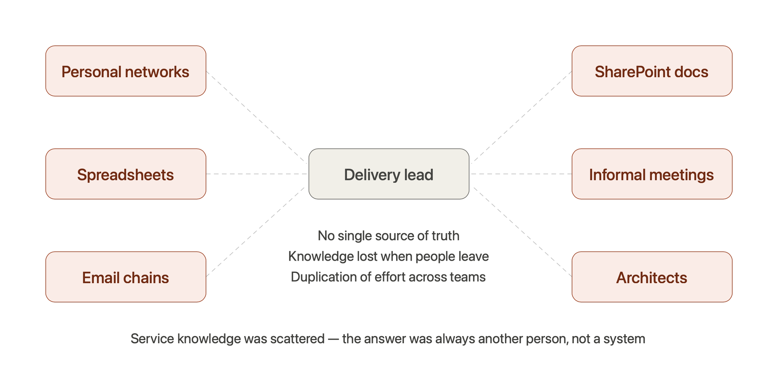
Service knowledge across DEFRA was fragmented. There was no single place where delivery leads could find out what services existed, who owned them, or how they were performing. People found out about services through personal relationships, informal conversations at senior level, or when something went wrong. Duplication of effort was common because teams had no reliable way to check whether something had already been built before starting something new.
For policy professionals, the problem was even more acute. If a policy intervention touched a service that already existed, there was no easy way to find that out. The answer was usually another person, not a system.
The Service Insight Tool was built to fix this. But without a clear understanding of how different user groups thought about services, what language they used, and what they actually needed to do their jobs, the tool risked solving the wrong problem in the wrong way.
My approach: end to end research ownership
Stage 1: Gap analysis
My first task was to understand what the team knew, what they assumed, and where the evidence was missing. I carried out a gap analysis that gave us a clear picture of the questions that needed to be answered before design could begin. This was the foundation everything else was built on.
Stage 2: Stakeholder interviews and schema development
I planned and conducted structured interviews with internal DEFRA staff to understand how people currently found and shared service information, what mental models they brought to the problem, and what a tool like this would need to do to be genuinely useful. These were not usability sessions. They were discovery interviews designed to surface the shape of the problem before any solution existed.
The insights from these interviews fed directly into the development of a schema for the Service Insight Tool, defining what information needed to be captured for each service, how it should be structured, and what terminology made sense to the people who would use it. This schema became the foundation the interaction designer and business analysts worked from.
Stage 3: Co design and card sorting
Because taxonomy was identified as a high risk area early on, I planned and facilitated a co design session with internal stakeholders before the prototype was built. This was not a testing exercise. It was a collaborative session where participants helped shape the language and structure of the tool from the start, bringing their own vocabulary and mental models into the room.
As part of this I ran a card sorting exercise to validate the taxonomy. Participants sorted service types, roles, and categories into groupings that made sense to them, revealing significant gaps between the labels the team was using internally and the language participants reached for naturally. The findings directly informed the information architecture and content design of the prototype, and flagged taxonomy as an area that would need continued attention into usability testing.
Stage 4: Research plan and usability testing
Once a prototype had been built in Figma, I wrote a full research plan covering objectives, participant criteria, task scenarios, and a session guide. The plan was structured around the GDS Service Standard so findings could be mapped to recognised government design principles throughout.
Remote usability testing was conducted via Microsoft Teams across ten sessions between April and May 2026. Participants shared their screen while interacting with the Figma prototype. Sessions were recorded and transcribed to support synthesis. Each session lasted between 31 and 68 minutes depending on participant role.
Six task based scenarios were tested in every session.
Synthesis Framework
I applied the GovUR framework throughout, structuring each session's observations around what participants were doing, thinking, and feeling as they interacted with the prototype. This gave the team a consistent method for moving from raw observation through to insight and then to user need, session by session. Findings were written up as user needs in the standard GDS format: as a, I need, so that. Red flags were tracked and escalated after each session so the team could act without waiting for the full programme to conclude. Eight themes and eight red flags emerged across the ten sessions.
Key Findings
A feature designed to support pre-meeting preparation went unnoticed in six out of ten sessions. Participants reacted positively once they discovered it, but without the familiar visual icon they associated with the feature from other Microsoft products they used daily, the text link in the navigation did not register. This was escalated as a confirmed discoverability failure and a fix was required before further testing continued. Mapped to GDS Standard 4.
Delivery confidence against outcomes was the most consistently raised missing piece across the research. Senior delivery leads did not think in terms of service phases or technical status. They thought in outcomes and funding envelopes, reflecting how they were held accountable within DEFRA. This was raised unprompted in four sessions and confirmed as a must-have field. Mapped to GDS Standards 2 and 10.
Taxonomy was a problem in all ten sessions, confirming what the earlier card sorting had already flagged as a risk. Two labels consistently misled participants, and the confusion had become a data integrity problem as well as a usability issue because inaccurate records had been created as a result. Mapped to GDS Standards 4 and 13.
Contact routes were the missing link between awareness and action across five sessions. Participants could identify a relevant service or dependency but had no way to do anything about it because there was no service owner name or contact route on the page. Mapped to GDS Standard 14.
Senior delivery leads consistently described a threshold model for risk: only surface what exceeds a defined severity level, and treat everything else as stable. A flat list of every risk was not useful in a governance or spending review context. The design principle that emerged was simple: stable equals invisible, critical surfaces itself. Mapped to GDS Standards 4 and 10.
Trust in the data was a recurring theme. Participants needed visible signals that information was current before they would use it in a senior meeting. A static timestamp alone was not sufficient.
Outcome
The research produced a comprehensive output package delivered at the end of the programme. This included a full synthesis deck covering eight cross-cutting themes tracked across all ten sessions, three participant personas with mental models and job-to-be-done profiles, seven design implications mapped explicitly to the GDS Service Standard, and a prioritised backlog of must-have, should-have, and deferred recommendations ready for the next sprint.
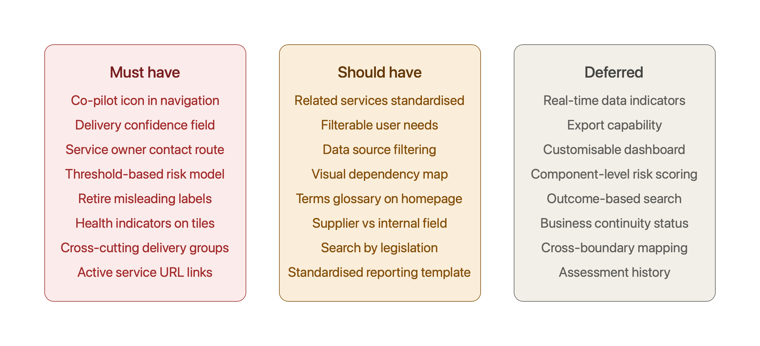
Next steps were scoped and handed over at the end of the engagement, including card sorting to validate replacement taxonomy terms, a second round of usability testing once prototype fixes were in place, and focused sessions on the cross-cutting and risk features that could not be fully evaluated in this round due to prototype data gaps.