
Independent UX & Accessibility Audit:
Digital Inclusion Initiative
Case Study
Client:
Digital Inclusion Initiative is a non profit working to bridge the digital divide, helping people build digital skills, access training, and find economic opportunity. Their work focuses particularly on women and underserved communities who face barriers to digital access and confidence.
My role:
Independent UX and accessibility consultant, commissioned directly by the client outside of any agency or employer relationship.
Project Brief
Digital Inclusion Initiative approached me to carry out a heuristic evaluation of their website. As an organisation supporting people with low digital confidence and varying literacy levels, they needed to understand whether their own site lived up to the standards they were promoting to others. With no in house design or development expertise, they needed findings they could understand and act on without any technical background.
I led the project end to end, from scoping the evaluation through to delivering the final report and a summary for the client.
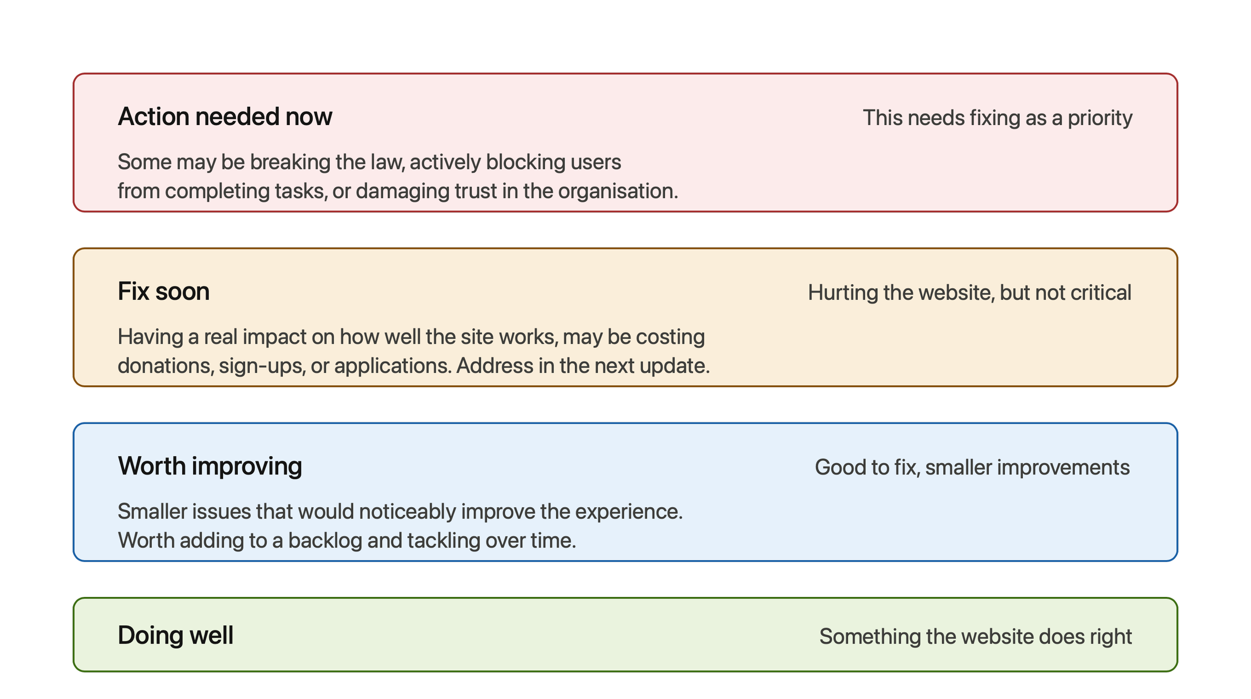
Rating System Used:
My Approach
I reviewed the site against established usability heuristics and WCAG 2.1 AA accessibility standards, covering every page and key interaction. Rather than handing over a technical audit, I rewrote all findings in plain English, replacing jargon and framework references with everyday language, so the client could understand not just what was wrong but why it mattered for their users.
Key Findings
Too many competing priorities on the homepage
Visitors landed on the homepage to see five calls to action of equal visual weight: donate, become a volunteer, view events, become a partner, and share your expertise. When everything is presented as a priority, nothing is, and this is one of the most common reasons charities see low conversion on their primary goals. I recommended choosing one main action and moving the rest into a secondary "get involved" section further down the page.

2. The people the organisation exists to serve were invisible on the homepage
Almost every call to action spoke to people looking to give something, donating, volunteering, partnering. Women and underserved community members looking to benefit from a programme had no clear way in. I recommended a simple split near the top of the page, giving each audience, supporters and beneficiaries, a clear path to what was relevant to them.
3. A genuinely inclusive idea let down by execution
The site offered an audio introduction, a thoughtful idea for visitors who prefer listening or struggle to read. However there was no written transcript, meaning deaf or hard of hearing visitors could not access it at all, and once playing, there was no way to tell whether the audio was active, paused, or finished. I flagged the missing transcript as the most urgent issue in the entire review, while also noting that the underlying idea was a genuine point of difference worth preserving.
Outcome
I delivered a full written report covering all seven areas of the site, with each finding rated by urgency so the client could prioritise without needing design or technical expertise to interpret it. Every recommendation was paired with a clear "what to do" step, written so it could be handed directly to a developer or website platform support team.
Alongside the report, I sent a short summary email to the client, written in a warm, plain tone, explaining the headline findings and suggesting where to start. Given the audio transcript issue was a legal accessibility requirement, this was flagged as the priority action.
The format of the report itself was part of the deliverable. Because DII's own mission is about making digital spaces accessible to people with low confidence and literacy, it mattered that the review modelled that same standard, plain English throughout, no jargon, and a rating system that made it immediately clear what needed attention versus what could wait.
The client came away with a practical, prioritised roadmap they could begin working through with their developer, along with a clear sense of what they were already doing well and worth preserving, not just a list of problems.
This project reflects the kind of work I want to do more of, using user research and accessibility expertise in service of organisations doing genuine public good. DII's mission is to reduce digital exclusion, and a website that itself excludes people through poor accessibility or confusing navigation works directly against that goal. Applying Nielsen's heuristics and WCAG 2.1 AA gave the review a recognised, evidence based foundation, but the real value was in translating that rigour into something a small non profit with no design or development team could act on immediately.
For an organisation with limited resources, every barrier removed from their website is one less barrier between them and the people they exist to help, whether that's someone trying to access a programme, a potential volunteer, or a donor deciding whether to trust the organisation with their money. Independent reviews like this are often the only quality check small non profits get, which makes getting the tone and clarity right just as important as getting the technical findings right.